 With the proliferation of smart phones and tablets the importance of making a website display effectively on a range of devices and screen sizes has become hugely important for anyone considering developing a modern website.
The latest approach to managing the variety of screens your website is likely to be displayed upon has been the development of Responsive design themes. A responsive design theme allows a website that utilises a database driven content management system (CMS) to effectively adapt its display theme to display on the device being used.
Previously
Previously accommodating a mobile device often meant the creation of a dedicated mobile website, this effectively added significant cost to the creation of a company’s online presence, it also added additional maintenance cost as updates to content were required in two places. The mobile website was generally built to target a specific mobile device - perhaps a phone and with that came the limitations for users on other devices.
A responsive theme simplifies this for the website administrator, content is updated once within the content management system and then a process involving device detection is utilised to apply an appropriate theme to the website content.
More Mobile
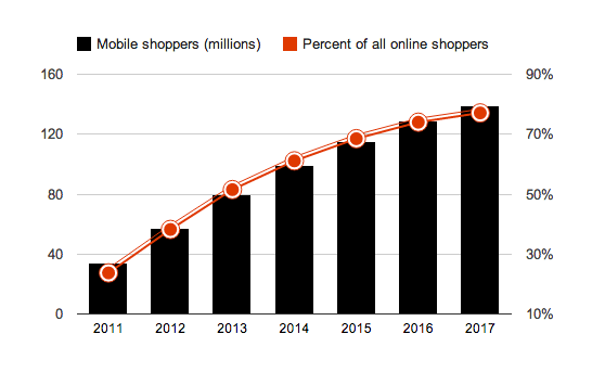
The number of online shoppers that utilise mobile devices is continuing to skyrocket.
This new platform not only allows consumers to buy product, it is changing the way people shop, smart phones are being used by consumers to compare prices, find store directions, lookup product info, check store hours and get the best deals while on a shopping trip. To maximise the opportunities you may have your website needs to be mobile friendly
How?
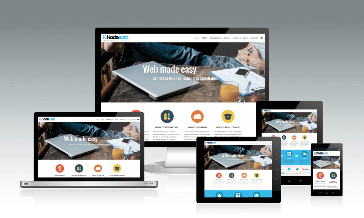
When crafting a custom design for a customer the Koda graphic design team produce a series of layouts that maximise usability on a variety of screen sizes, including Desktop, Laptop, Tablet and Smart phone. Refinements are added to ensure content is easily accessed, refinements like the use of images as links rather than text, to accommodate the finger of a user, a main menu that collapses and opens on demand are features that ensure the mobile user experience of your website is maximised.
Koda deliver responsive design themes with all of their website development projects, we recognise the importance of the mobile user and deliver solutions that enable their engagement. To find out more please contact the Koda team, we’d love to discuss responsive theme options with you.