Smart Phone Optimisation
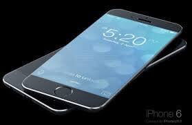
Apple recently announced the release of the new Apple iPhone 6 and the Apple iPhone 6 Plus, if past experience is anything to go by there will be another spike in mobile device usage on the web once they are released in late September (United States). With the continued increase in the number of Smart devices used to browse and purchase product on the internet, and with the increase in the use of Responsive themes to tailor content for the web. Web design and development agencies need to be continually evolving their approach to enhance the user experience for the Smart device user.
How much thought is given to the design of these interfaces?
Design for Screen resolution
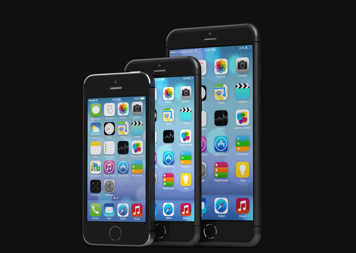
The iPhone 6 and iPhone 6 plus represent a great example of the consideration that needs to be given to the screen resolution of the smart device the responsive design theme is designed for. Both of these new Apple devices have screen resolutions considerably bigger than their predecessor the iPhone 5s, (They are comparable to the Samsung Galaxy S5).
What does this mean?
A responsive theme can be tailored based on the device being used, where we have more screen real estate available we are able to adjust the layout accordingly:
- This might mean we can display two columns side by side rather than stacked
- It may allow us to include a detailed graphic that on a smaller device may not have been readable
Device detection allows us to apply appropriate responsive design themes based on the resolution of the specific screen resolution.
Responsive Design
As part of the design process for your new website, time needs to be allocated to the design, layout and navigation associated with the responsive design theme. It is no longer good enough to say "we include a responsive theme with your website design", the responsive design needs to be thought through and the user experience considered by a team that have experience designing these interfaces.
In some cases content available on your laptop or desktop may not be display correctly on your smart device, this is often true of product specification and detailed information, the design team will consider whether content can be displayed, in conjunction with the client they decide whether it should be displayed, and based on answers to these questions the design will be refined.
What does it mean?
 What the release of new technology (like the iPhone 6 range) poses to web design companies is that we need to be constantly adjusting our offering, ensuring that we are maximising the benefit smart devices afford your customers.
Staying abreast of new technology and offering insight to existing and prospective customers on what is fad and what potentially is game changing is part of the role of your web design and development partner.
The design team at Koda Web are focused on delivering a user experience that is maximised for all devices and screen resolutions, when you are ready we would love to discuss options in more detail.