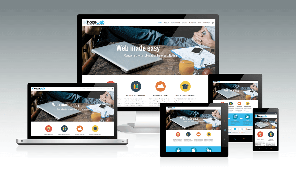
There’s responsive and then there’s "Responsive design"!
It is encouraging to see that many more agencies are incorporating responsive design themes in their website design and development projects. For many the responsive theme comes pre built into a template. For others (and Koda is one of them), the responsive design is unique to the website we build and tailored to your website's functionality and content.
Is there a difference?
Let’s start with a basic statement,
“If you haven’t got a responsive or mobile version of your website there will be a significant number of potential customers and contacts that will enjoy a terrible experience as they try to navigate your site.”
All thinking and forecasting suggests that Mobile smart phone interaction with the web is destined to continue to increase for the forseeable future, and why not? Mobile devices are becoming more and more poweful with features that really do challenge the the desktop and laptop market.
So, we agree at the very least you need a responsive design theme for your website!
Compare
Now let’s compare an “out of the box” (Templated) responsive design theme versus one tailored for your website content and functionality. The differences are subtle yet significant.
- Provide a search box that is easy to access and visible on the home page, accessing content easily accessible on the desktop is not always easy on a mobile device, providing an intuitive search interface allows relevant content to be exposed easily to site visitors
- Out of the box, responsive themes will simply resize the current search interface, this is good, though could be better with a small amount of customisation
- Simple things to implement like inline validation can stop the frustration associated with rectifying input errors, and losing previously saved data,
- Out of the box templates don't always offer this
- Removing unnecessary data from the responsive theme, think about what your clients want to see when using their mobile device and tailor content accordingly
- This needs to be thought through and customised in the responsive design, not present out of the box
- Think about the input controls available on a mobile device and optimise the responsive theme to improve the user experience, how do you emulate a mouse over effect on a touch screen for instance?
- An out of the box solution will simply take what you have on the Desktop version of your site and size it to display effectively on a mobile screen
Just ticking yes to the “Do you have a responsive theme?” checkbox is no longer enough. When considering your new website design and build project consider the responsive design in more detail, the mobile experience associated with browsing your site is important and will continue to be more so. Discount them at your peril, if the experience is not up to it, they will quickly move on, they are spoilt for choice!
Solution
If you’d like to learn more about the Koda Web approach to responsive mobile website themes, please contact us, we’d love to discuss options.